
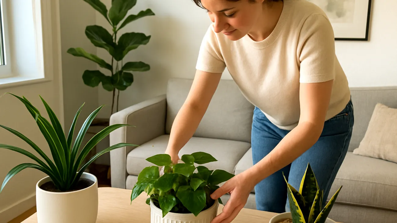
Decorating with plants adds more than color or life to a room—it shapes the entire visual balance of an interior. But one common obstacle undermines the effect: mismatched or poorly chosen decorative plant pots. A room can be curated with thoughtful furniture, elegant lighting, and tasteful art, yet the wrong pots silently disrupt the visual rhythm. Plant containers, far from being neutral objects, are design elements in their own right that influence how we experience our spaces.
The problem becomes especially apparent when multiple pots are placed together. If they vary drastically in style, material, or proportion, they pull attention in conflicting directions. A lush monstera in a plastic nursery pot placed beside a sculptural snake plant in an ornate ceramic urn doesn’t read as eclectic—it reads as unresolved.
This visual discord isn’t merely about personal preference—it stems from fundamental principles of how humans process spatial information. Research in environmental psychology has shown that visual coherence in interior spaces directly impacts cognitive comfort and emotional well-being. When decorative elements compete for attention rather than complement each other, the brain experiences cognitive overload, leading to subtle but persistent feelings of unease.
Why Material Choice Changes Everything
Few home items combine function and form as tightly as plant containers. Aesthetically speaking, every pot communicates something, whether it intends to or not. Material tells one story, shape another, and finish yet another. The key is consciously aligning those messages with your home’s design vocabulary.
Research conducted by color consultants has demonstrated that material choice significantly impacts how colors are perceived in interior environments. This finding has profound implications for plant pot selection, as the same plant can appear dramatically different depending on whether it’s housed in a matte ceramic vessel versus a glossy metal container.
Ceramic pots in neutral tones suggest minimalism, clarity, and deliberate simplicity—hallmarks of Scandinavian or modern interiors. Matte-finish ceramics in white, charcoal grey, or pale sand finishes support monochromatic palettes and graphic spaces without adding visual clutter. These finishes absorb light differently than glossy surfaces, creating visual anchoring points that help establish spatial hierarchy within a room.
Terracotta pots, especially unglazed, introduce a rustic, earthy tone and are particularly fitting in homes with natural wood, woven materials, or Mediterranean influences. Their warm porous texture stands out beautifully against whitewashed walls or stone floors. Natural materials like terracotta activate the same neural pathways associated with outdoor environments, contributing to stress reduction and improved mood in interior spaces.
Woven baskets as cachepots offer a tactile contrast indispensable for bohemian, cozy or coastal styles. They pair beautifully with draping plants like pothos or ferns and soften rooms where textiles and woods already play a major role. Woven materials introduce visual texture that can make spaces feel more intimate and comfortable, particularly in larger rooms where hard surfaces might otherwise dominate.
Concrete or fiberstone pots deliver weight and sculptural value, aligning with industrial or urban interiors. Their raw look balances leafy or trailing plants and benefits from being surrounded by metal, stone, or salvaged wood elements. Concrete’s neutral color temperature makes it particularly effective at highlighting the green spectrum of plant foliage, creating stronger visual contrast than many traditional ceramic options.
Consistency in material cohesion is more important than perfect color matching. Three pots made of different materials in the same color can look discordant, while three terracotta containers in different shapes and sizes still feel connected. This principle reflects how the brain prioritizes material recognition over color matching when establishing visual relationships between objects.
The Psychology Behind Color Coordination
Color is the most immediate signal the eye picks up from a decorative element. Clashing pot colors—especially when paired with green, which is present by default in foliage—can overwhelm or fragment a scene. This isn’t simply aesthetic preference; it’s rooted in how human vision processes color relationships.
The human eye naturally seeks color harmony through either complementary relationships or analogous groupings. When these relationships are absent—as often happens with randomly selected plant containers—the visual system experiences chromatic discord that creates subtle discomfort.
Instead of searching for the perfect color for each pot, start by defining a core palette aligned with the room’s dominant hues. For contemporary spaces, this might mean black, white, and stone gray. For warm, rustic rooms, consider terracotta, olive, mustard, or deeper clay reds.
- Limit your visible palette to two accent colors plus one neutral, reinforcing cohesion
- If you want variety, vary tone rather than hue—use several shades of grey rather than both blue and purple
- Use green foliage as a unifier—consistent living green allows subtle variations among pots to feel cohesive
Painted pots add more risks than benefits unless applied with design intent. A hand-painted pot may look charming in an eclectic kitchen but out of place in a sleek home office. Be cautious with novelty patterns or bright geometric prints unless they echo existing motifs in rugs, curtains, or art.
Height Variation Creates Visual Interest
Height is one of the most intuitive but underutilized aspects of pot arrangement. Many people intuitively align items at the same height—placing three small pots side by side—but this flattens the display and diminishes visual engagement.
The principle of varied heights isn’t arbitrary; it’s based on decades of research in visual perception. The human eye naturally seeks visual triangulation—the tendency to connect objects of varying heights into implied geometric relationships. This creates movement and visual interest that static, uniform arrangements cannot achieve.
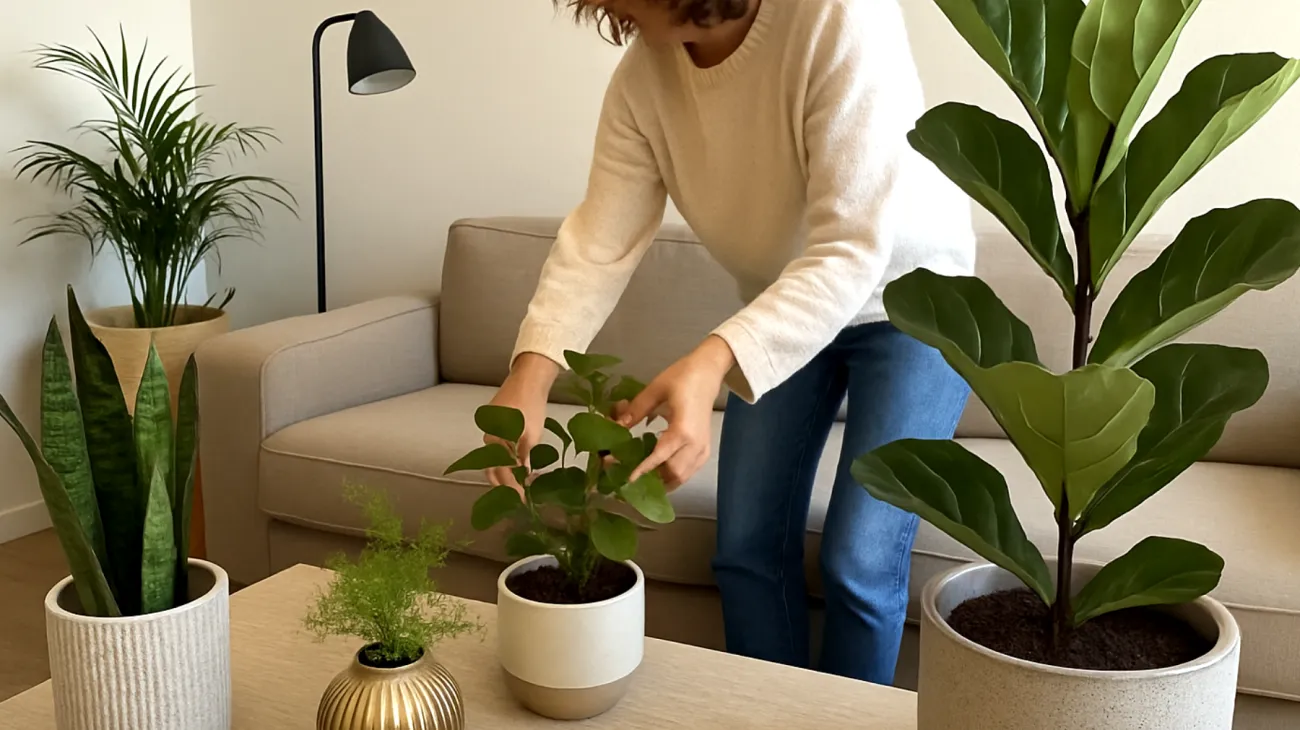
Arranging pots and their plants in sequences with varied height and proportion introduces a sense of rhythm and intentional composition. This variation mimics natural landscapes, where no two elements align perfectly yet form a coherent whole.
- Group pots in odd numbers (three, five, seven) rather than even numbers—this enhances visual tension and balance
- In each group, aim for at least one tall plant, one medium, and one trailing or wide plant
- Use risers or books to subtly elevate lower pots without drawing attention to the support
Avoid placing all large pots in one corner and all small ones elsewhere. Instead, create clusters that visually anchor different areas of the room. A trailing plant on a tall side table might balance a tall fiddle leaf fig on the floor nearby. This type of flexible asymmetry is easier to create when pots and plants are chosen in tandem.
Understanding Plant-to-Pot Proportions
The relationship between plant and container goes beyond just pot size. A pot that’s too small will feel oddly overwhelmed by a large plant, even if the roots technically fit. The visual scale matters more indoors than in nurseries or outdoor settings—indoor spaces compress information, so subtle disproportions become more noticeable.
Indoor spaces create proportional amplification—where small discrepancies in scale become more visually prominent due to the controlled nature of interior environments. Unlike outdoor settings where natural variation masks minor proportional issues, indoor spaces demand more precise relationships between containers and their contents.
Choose a pot diameter at least one-third the width of the plant’s foliage spread to avoid a top-heavy look. Slow-growing upright plants like sansevieria or dracaena suit taller, narrower vessels that emphasize their vertical growth. Trailing plants like philodendron or string-of-pearls benefit from wide, bowl-shaped pots that allow foliage to drape around the edges.
Don’t use identical pots for all plants unless aiming for strict formal repetition. Instead, coordinate levels of visual weight—a light-leafed plant will feel balanced in a visually heavy pot, and vice versa. The most successful plant-container pairings achieve complementary contrast—where the visual characteristics of the plant and pot enhance each other without competing.
The Foundation Matters More Than You Think
One often-ignored but impactful aspect of pot placement is their interaction with the floor and what’s beneath. Aesthetic harmony can collapse if the base of the pot visually fights with its platform, shelf, or table. The human brain processes the relationship between an object and its support surface as a fundamental stability cue.
Examples of poor base alignment include a rounded-bottom basket placed on a thin metal shelf, a high-gloss ceramic pot placed on a deeply textured wooden slab, or a short, wide pot on a tall narrow stand. These mismatches create visual tension that undermines the overall comfort of a space.
To avoid these issues, pair round-bottomed pots with solid, flat surfaces that match their finish class. Use plant stands, saucers, or risers that extend slightly beyond the pot base, rather than smaller than it. For low or ground pots, place a textured rug or platform under monochrome ones to prevent them from blending too flatly into the floor.
Creating Harmony Without Uniformity
When styling your home with decorative plant pots, the goal isn’t uniformity but coherence. The best plant arrangements don’t repeat—they converse. A matte black pot near a soft burlap-wrapped cachepot works if both share tonal neutrality. A minimalist white ceramic doesn’t clash with a terracotta vessel if spaced thoughtfully and anchored on shared themes.
Successful interior arrangements achieve harmony through shared characteristics rather than identical elements. This concept of unity with variety represents the art of creating connections between diverse elements without sacrificing individual character.
Some combinations that create harmony without redundancy include terracotta plus glazed earth-tone ceramic plus deep charcoal concrete for rustic-modern fusion. White matte porcelain with black fiberstone and smoked glass creates monochrome modernism. Woven seagrass basket combined with unfinished wood box and ivory clay tray delivers natural softness.
If unsure, limit yourself to three material types in a room and repeat them in different ratios across zones. Three distinct but related materials provide optimal variety while maintaining visual coherence—fewer materials risk monotony, while more than three can overwhelm the brain’s pattern recognition systems.
Building Long-term Design Confidence
The impact of well-chosen plant containers extends far beyond immediate visual appeal. Studies have documented measurable improvements in both plant health and human well-being when plants are displayed in thoughtfully coordinated arrangements. Environments that demonstrate visual consistency and intentional design choices contribute to restorative experiences—moments when the nervous system can relax and recharge.
Many design decisions feel daunting or expensive. Choosing and arranging decorative plant pots doesn’t have to be either. Most mismatched pots can be corrected not by buying new ones, but by rearranging, adding risers, using simple liners, or committing to a defined palette.
A stunning fiddle leaf fig can elevate a space—but so can five small pots, properly coordinated and spaced with intention across a bookshelf. When form follows function—and when function supports aesthetic flow—plants and their containers stop feeling like additions and start functioning as part of the architecture.
Beauty in the home often stems not from grand gestures, but from quiet corrections made consistently. The investment in understanding these relationships pays dividends not just in immediate visual improvement, but in the long-term satisfaction of living in a thoughtfully curated environment where every element contributes to the whole.
Table of Contents